The Palms
BRAND IDENTITY · ART DIRECTION · HOSPITALITY
-
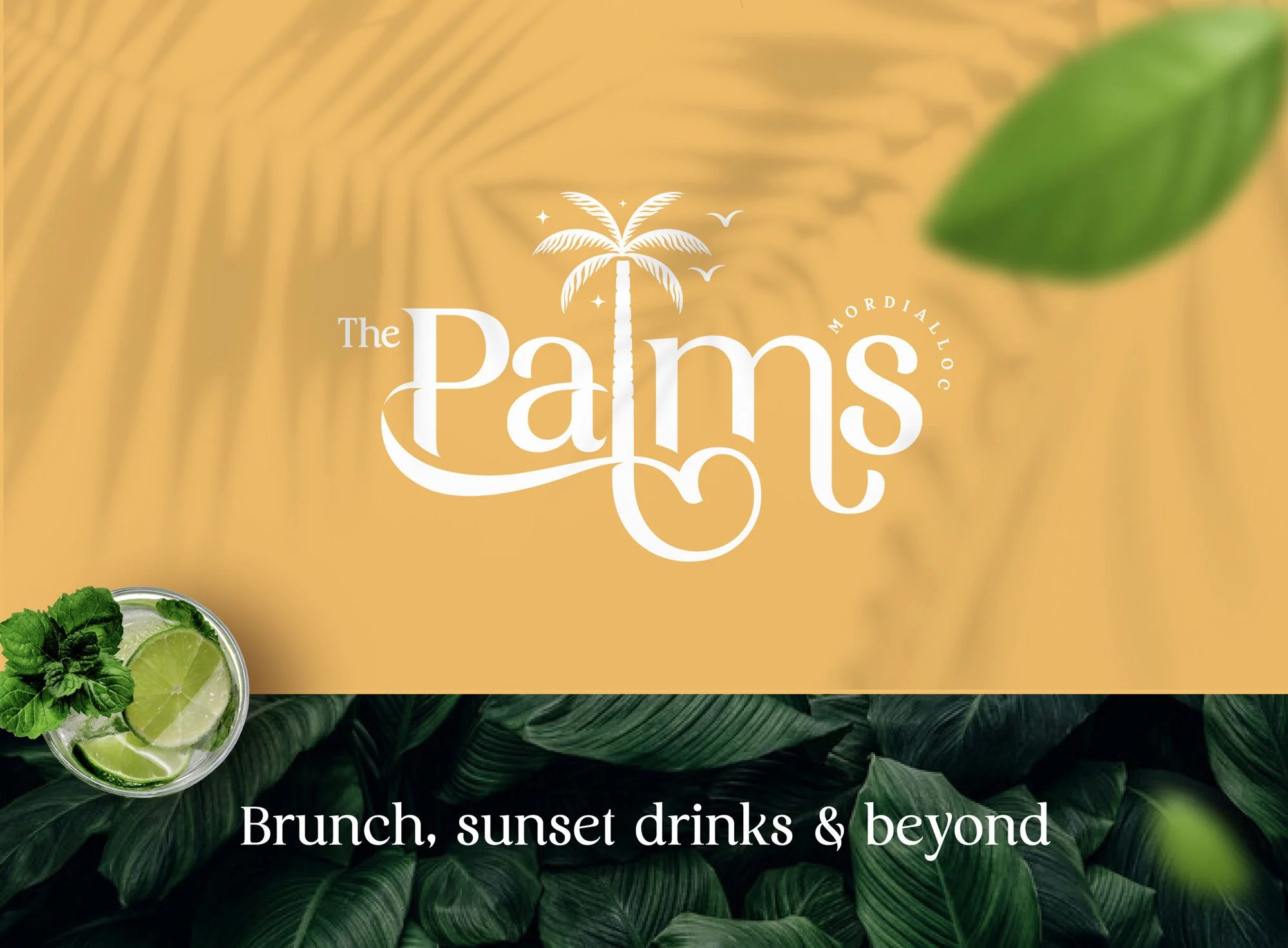
Nestled in the coastal town of Mordialloc, The Palms is a new hospitality destination inspired by the relaxed character of its surroundings. The brief was to create a distinctive identity that blended coastal Melbourne with the nostalgic sophistication of Palm Springs.
-
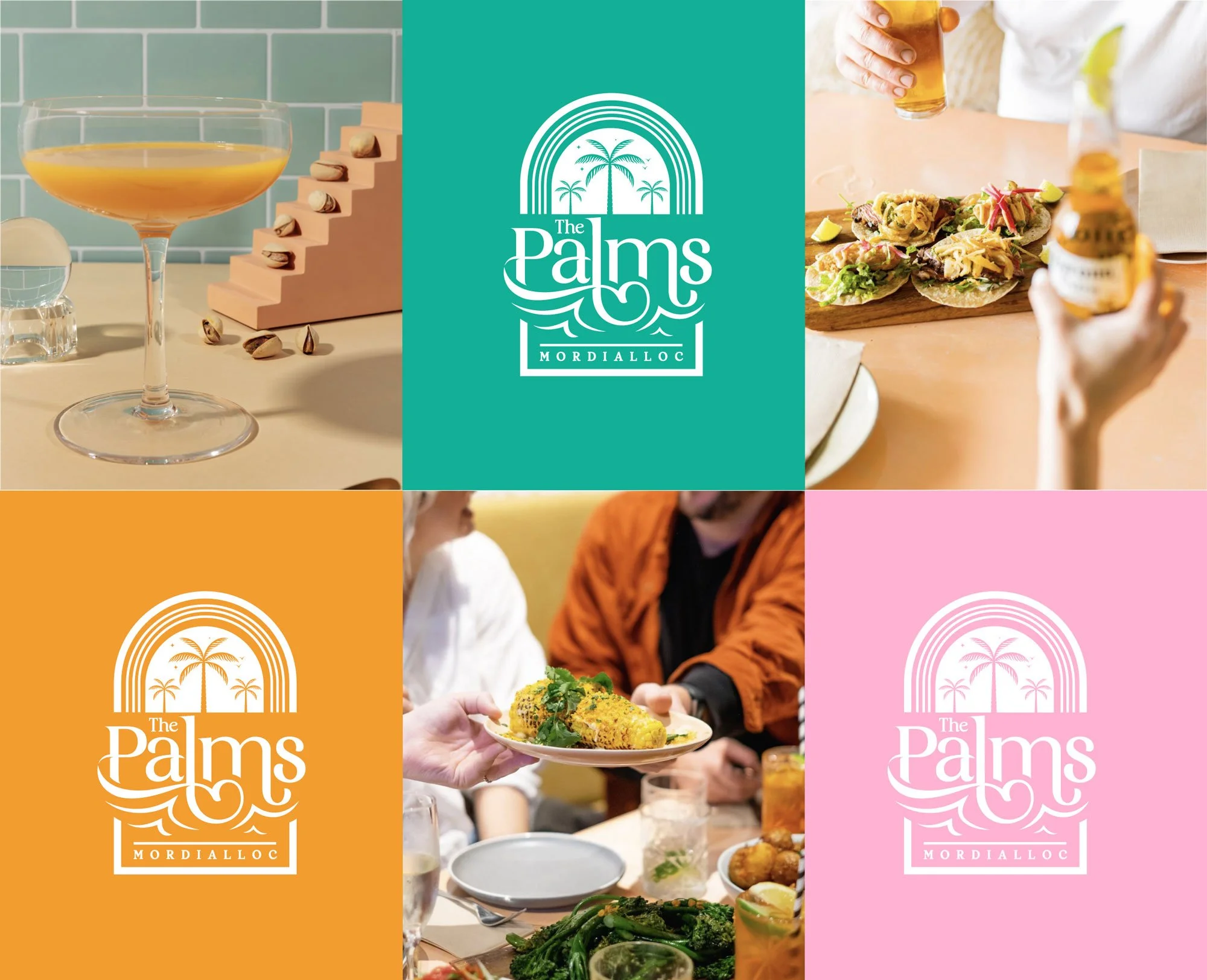
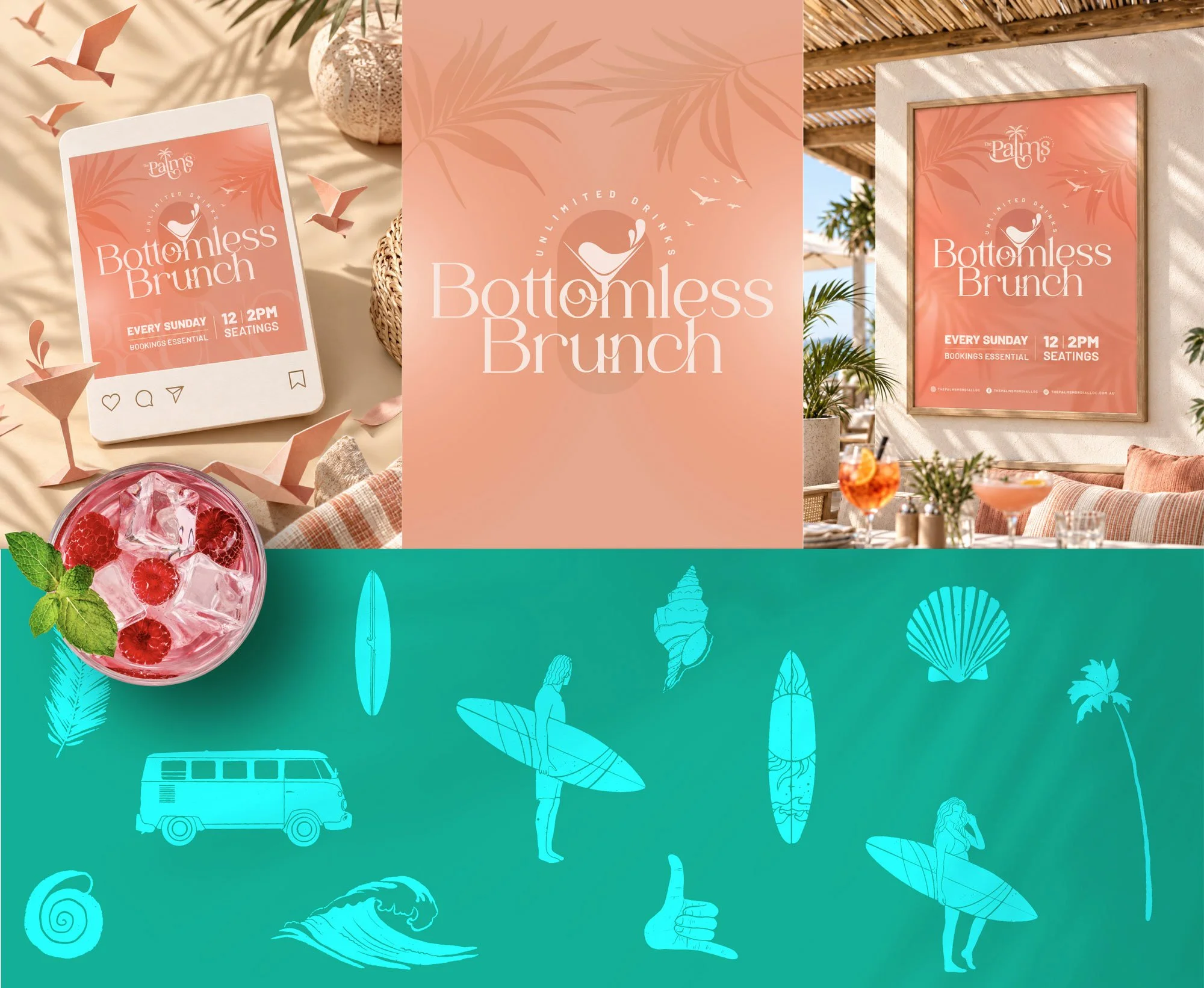
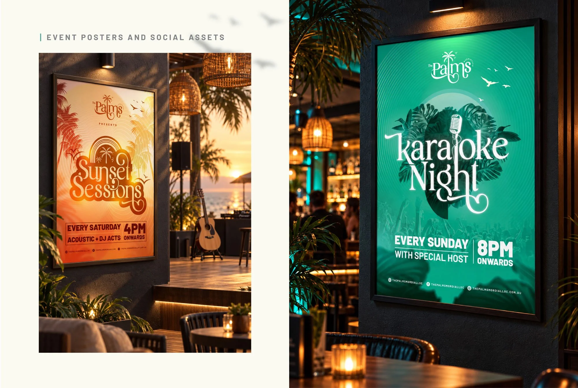
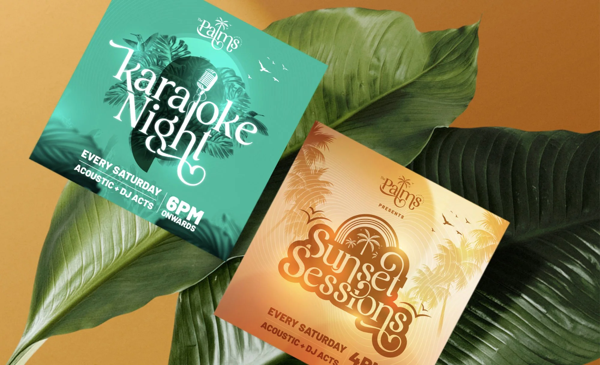
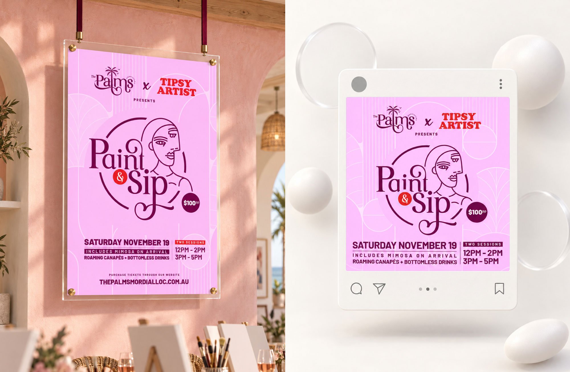
Drawing inspiration from the venue’s coastal location, Palm Springs influences and architectural details, I developed a visual direction that felt sophisticated yet relaxed. The identity encompassed the primary and secondary logos, bespoke typography, a pastel colour palette and a suite of supporting brand elements.
-
The primary logo captures the fluidity and elegance of palm-tree forms and is paired with a bespoke serif typeface incorporating subtle botanical details. The venue’s white arched brickwork inspired the secondary logo and the broader supporting graphics.
Together, these elements form a cohesive identity that feels refined, welcoming and distinctly connected to Mordialloc’s coastal character.