Hattori Hanzo
PRINT DESIGN · CREATIVE DIRECTION
-
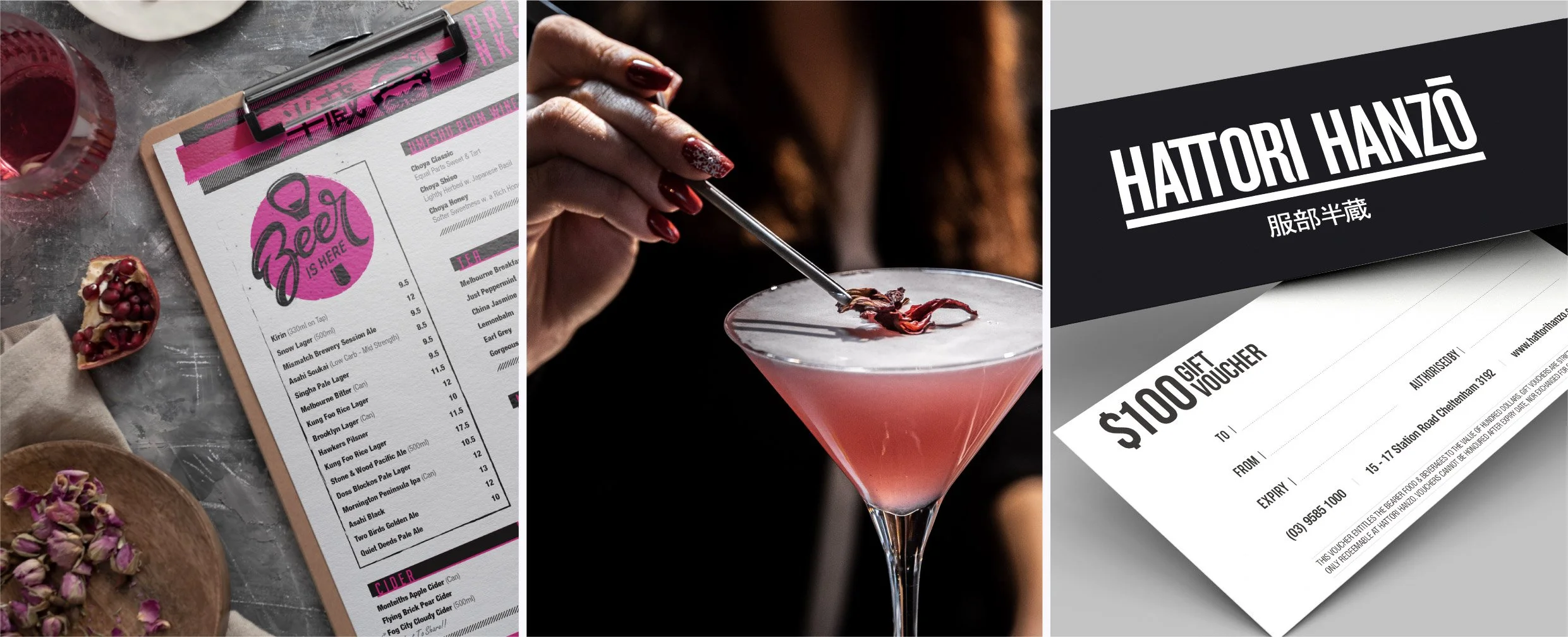
Hattori Hanzo is an urban Asian-fusion restaurant nestled in the streets of Cheltenham, bringing together flavours from across Asia in a menu full of variety and spice. Working with its existing logo and brand identity, the brief was to expand the visual language and translate the restaurant’s newly developed story across its menus, posters and supporting collateral.
-
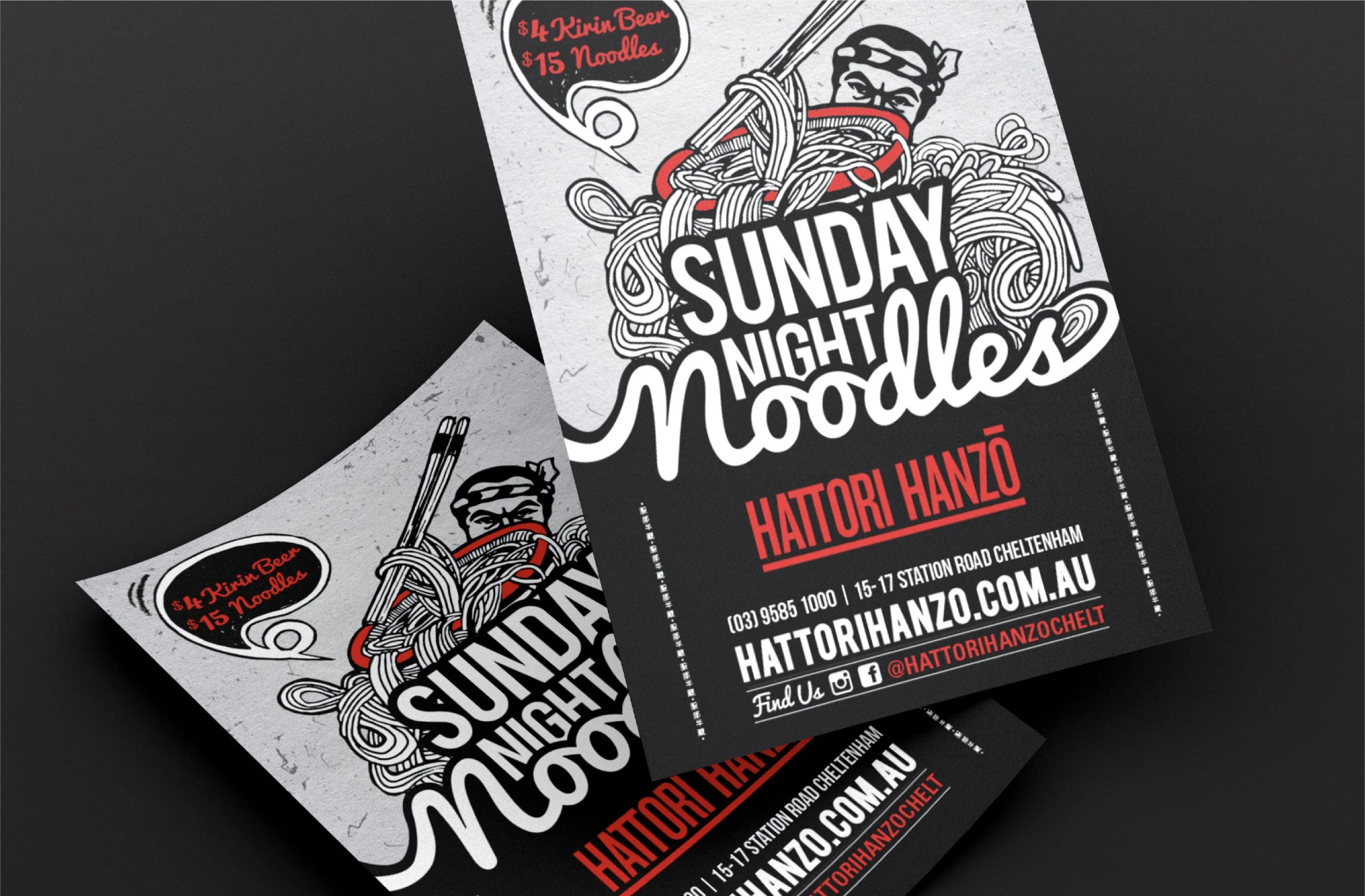
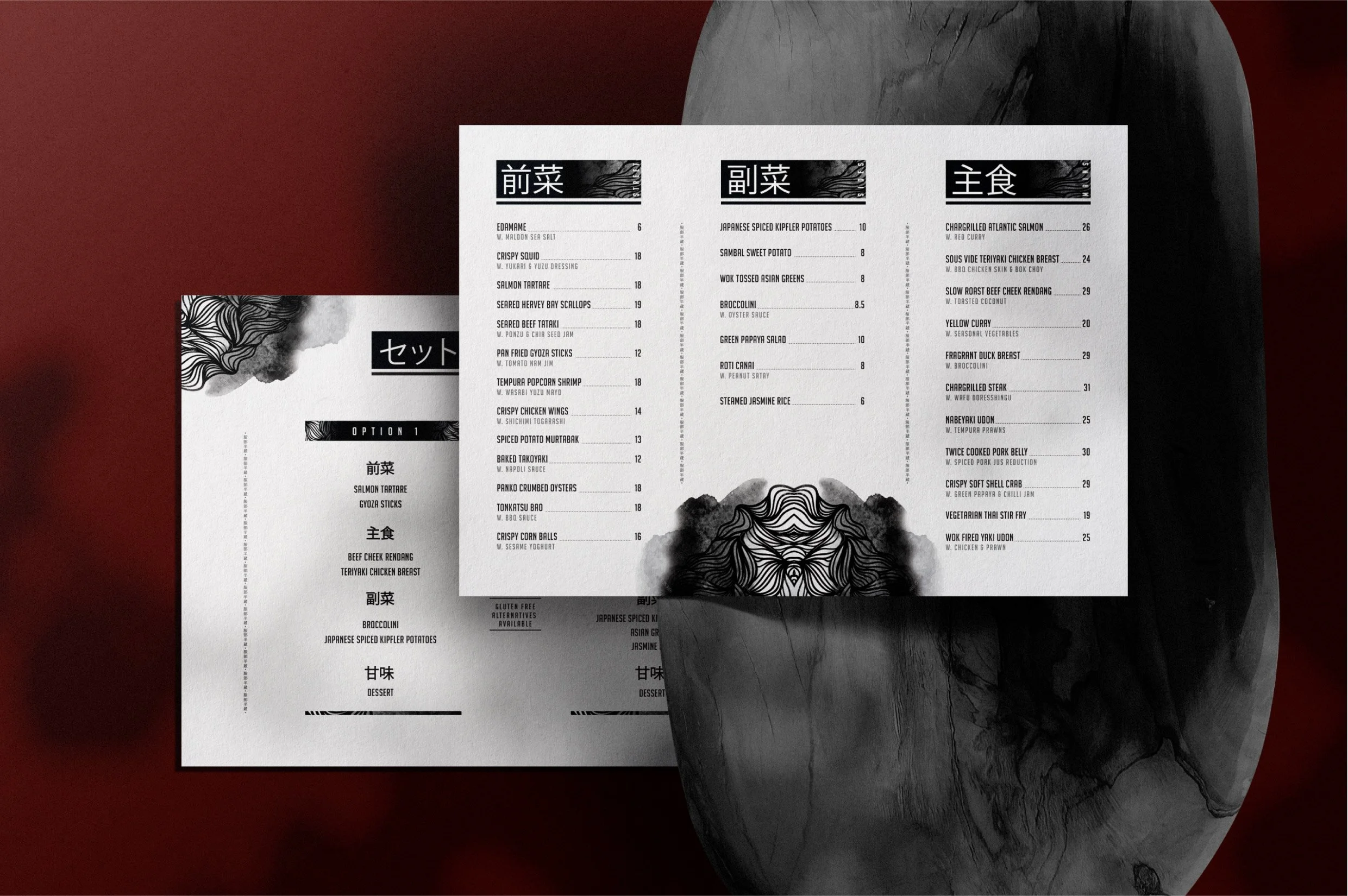
Drawing inspiration from the legendary Japanese samurai behind the restaurant’s name, I developed a layered creative direction using detailed textures, bold typography and cinematic imagery. These elements were designed to complement the existing identity while giving the restaurant a stronger and more distinctive personality.
-
The expanded visual language was applied across posters, menus and other print materials, creating greater consistency throughout the customer experience. The resulting collateral feels bold, atmospheric and adaptable while remaining grounded in Hattori Hanzo’s established identity.